Color Harmony Palettes – Create Stunning Designs & DIY Decor
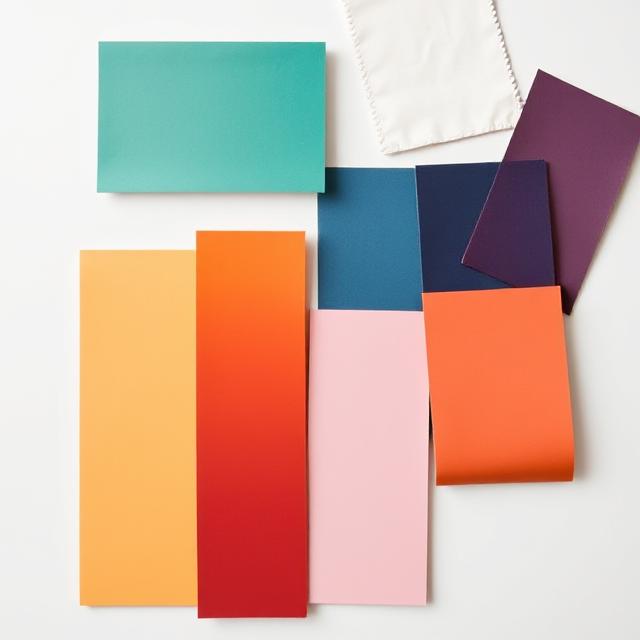
What Are Color Harmony Palettes?
Color harmony palettes are combinations of colors that work beautifully together. When colors are balanced and complementary, they create a feeling of unity and beauty — whether it’s in a painting, a logo, or your living room decor.
Think of it like music — when the right notes play together, the sound feels perfect. Similarly, when the right colors mix, your eyes feel relaxed and happy.
Why Color Harmony Matters in Design & DIY Projects
Color harmony doesn’t just make things look “nice.” It creates emotion, sets a mood, and tells a story.
For example:
- A warm palette (reds, oranges, yellows) feels cozy and energetic.
- A cool palette (blues, greens, purples) feels calm and relaxing.
- A neutral palette (whites, grays, tans) gives a modern and timeless look.
Whether you’re decorating your home or creating digital art, using the right color harmony can transform an ordinary project into something stunning and memorable.
The Basics of Color Harmony Theory
To create your own color harmony palettes, it helps to understand a few key color relationships from the color wheel:
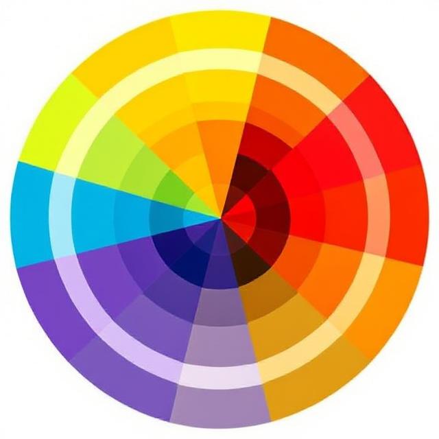
- Complementary Colors – Colors opposite each other (like blue and orange). They create high contrast and energy.
- Analogous Colors – Colors next to each other (like blue, teal, and green). They feel natural and calming.
- Triadic Colors – Three evenly spaced colors (like red, yellow, blue). They’re bold and balanced.
- Monochromatic Colors – Different shades of one color (like light pink to dark pink). Simple yet elegant.
- Split Complementary – One base color + two opposite-side complements. Dynamic but still balanced.
These formulas work as your foundation for building visually pleasing combinations for any project.
How to Create Your Own Color Harmony Palette
You don’t need to be a designer to make a great color palette! Here’s a simple step-by-step process:
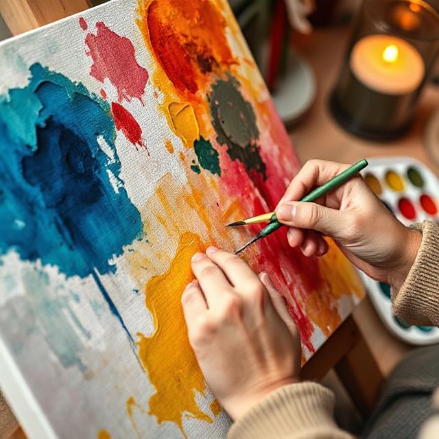
- Start with Inspiration:
Find something that catches your eye — a photo, a flower, a sunset, or even your favorite outfit. - Pick a Base Color:
Choose one dominant shade that sets the tone. - Add Supporting Colors:
Use the color wheel or a tool like Adobe Color or Coolors.co to find matching tones. - Balance Warm and Cool:
Mix a few warm and cool tones for depth and contrast. - Test and Adjust:
Apply your palette to an image, wall, or design mockup. See how it feels before finalizing.
🪶 Pro tip: Keep your palette between 3–6 colors for harmony and simplicity.
Using Color Harmony Palettes in DIY Decor
Color harmony isn’t just for designers — it’s a game-changer in home decor too!
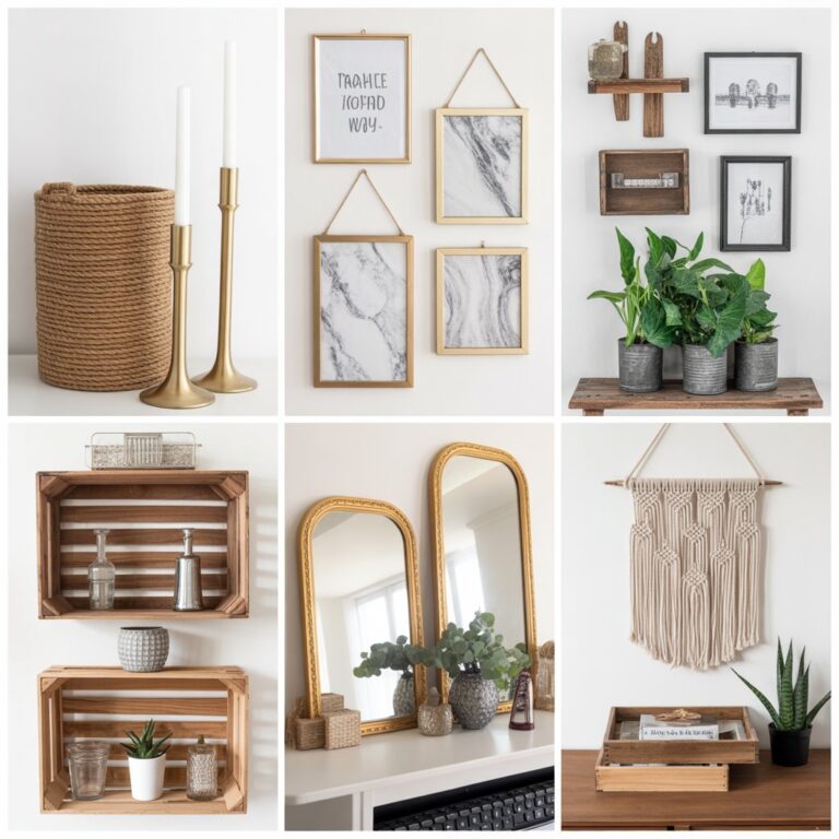
Here are a few creative ideas:
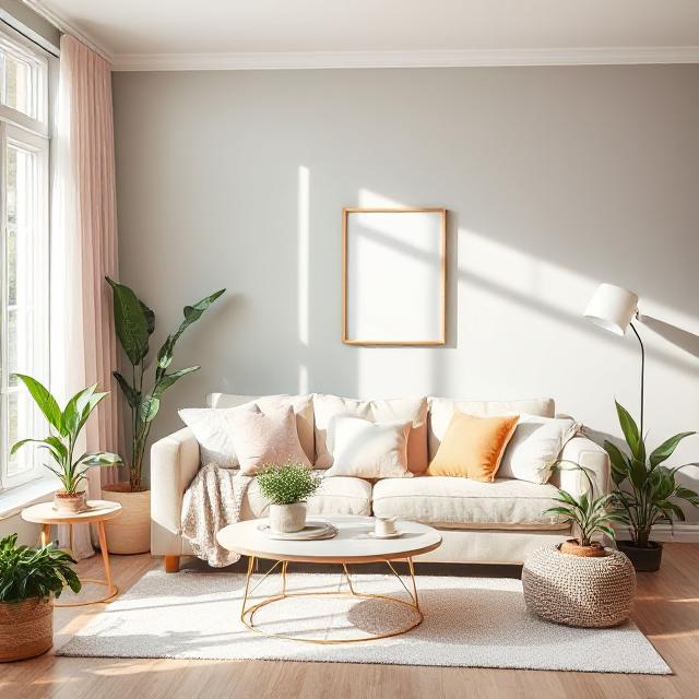
- Wall Paint Harmony: Use complementary colors for accent walls.
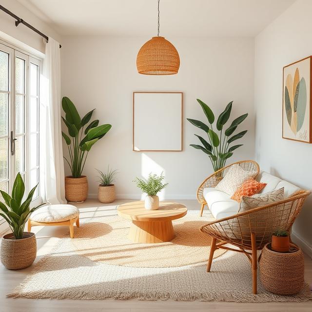
- Furniture & Fabric Balance: Pair a cool-toned sofa with warm cushions.
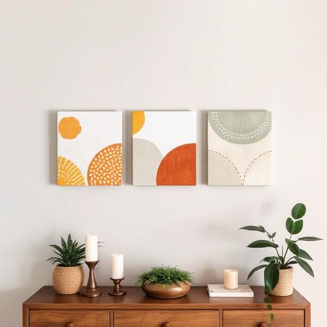
- DIY Art Projects: Paint abstract pieces using your own harmonious palette.
- Table Settings & Centerpieces: Combine neutral plates with pastel napkins for an elegant vibe.
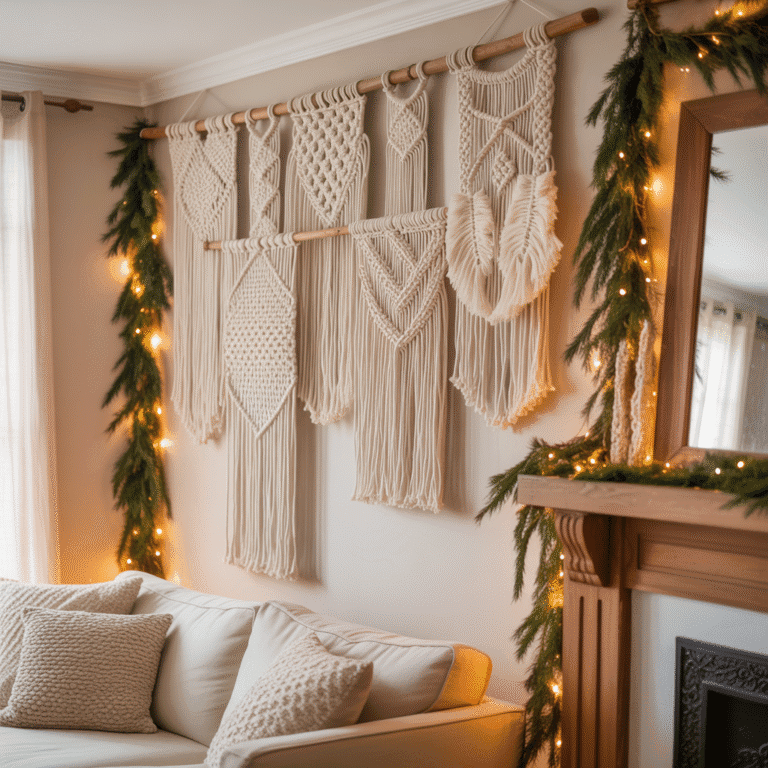
- Seasonal Decor: Soft blues and whites for winter, earthy tones for fall.
With a few color tweaks, even simple DIY crafts can look designer-made.
Using Color Harmony in Digital Design
For bloggers, artists, and content creators — color harmony helps your visuals pop on Pinterest, Instagram, and your website.
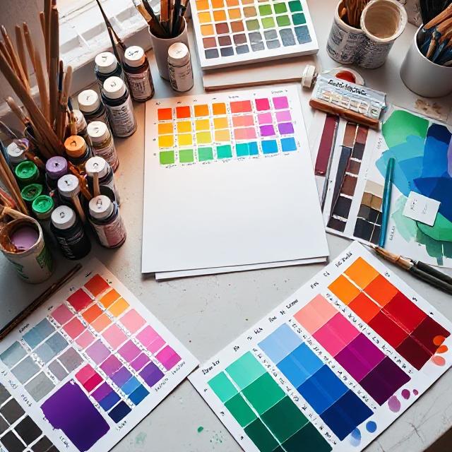
Tips:
- Choose one main brand color, then build a palette around it.
- Keep contrast high for text and backgrounds.
- Stick to consistent tones across images and graphics.
If you’re using Pinterest, pin designs that follow your color palette — it creates a cohesive aesthetic your audience will instantly recognize.
Best Tools for Creating Color Harmony Palettes
Here are a few free online tools you’ll love:
- 🎨 Coolors.co – auto-generates matching palettes
- 🖌️ Adobe Color Wheel – for professional designers
- 🌸 Canva Palette Generator – upload a photo and get instant color matches
- 🪶 Colormind.io – uses AI to suggest balanced tones
These help you build palettes faster and with professional results.
Final Thoughts
Color harmony palettes are more than just “pretty color combos” — they’re the visual rhythm of your art, decor, and creativity.
Once you start noticing how colors affect emotion and balance, you’ll be able to design anything — from a Pinterest pin to a cozy living room — that feels naturally beautiful and perfectly balanced.
So grab a photo, pick your colors, and start creating your own harmony today!
